In its bare bones, the WordPress dashboard is the workstation for webmasters who spend a large chunk of their Internet-time on dashboard while optimizing their website – be it publishing a post or adding some visually appealing bells and whistles. Or, in a more CMS-ian term, it is a form of admin panel.
That said, how does the dashboard of WordPress stand out of the herd of CMS platforms out there? Why is it in its own league? Why are homilies recited about its usability? Well, there are a whole lot of reasons that amount to WordPress dashboard being extremely user-friendly:
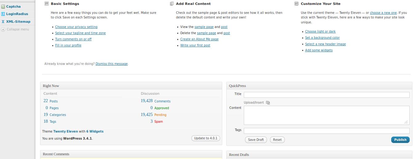
Home is Where the Everything is
How many shortcuts have you placed on your desktop? Plenty, I wager. When you’ve got everything at one place, it only trims down your effort and time while performing certain tasks as you are not compelled to follow a navigational route for every single thing.
- With the “Quick Draft” option, you can write a post from the very first dashboard screen, without having to click on “Post” from the menu displayed don the left panel.
- You have multiple shortcut to the sections like comments, recent activities, the website pages and so on.
- The first screen also provides links to the sections like menu and widgets.
‘Drag & Drop’ Makes Everything a Breeze
It’s all about putting everything in its right place, or as WordPress lets you to, drop everything at its right place. The drag & drop functionality saves a significant number of clicks and on a standard WordPress dashboard, it saves a hell lot of them, and that’s alone worth the price of admission.
Coming back to the first screen, the alignment of the different sections may not be to your liking. All you got to do is to align it to your preference is to simply drag the items and drop them at whatever spot of the screen you intend to.
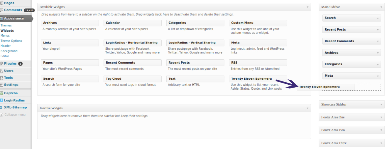
The drag & drop feature also extends to the internal sections of the dashboard. When you navigate to the sections like “menu” or “widgets”, or even media library, you’ll find out that you get the wherewithal to arrange the menu items and place them at respective points by simply dragging and dropping them. The same holds true for widgets. This functionality also comes handy for the WordPress gallery wherein you can arrange media files seamlessly.
No Squabbling Back and Forth During Scroll
Another factor that contributes to the usability-quotient of WordPress dashboard is the fact that even when you are scrolling down the screen, the menu on the left remains fixed. So you can be at any place on the dashboard, the main menu items will always be visible to you.
Responsive Structure for No Screen-Size-Blues
This one follows closely on the heels of the last point. The WordPress dashboard is highly responsive, which implies that it adapts itself to the varying screen sizes, without making you strain your eyes if you are accessing the dashboard from your mobile device. The menu items are displayed with utmost clarity, irrespective of whether you are on a larger desktop screen or on a Smartphone.
Besides this, if you deem that the working area is a tad too small, you also have the option of collapsing the menu that shrinks it in a way that you can intelligibly see the icons for each menu feature and identify them with ease. The icons are displayed boldly and in a manner most comprehensible.
The 2-Click Rule Rules
The prospect of minimization of clicks is always welcome since it saves efforts, howsoever small it is. WordPress makes it possible for you to find all the information you intend to find with no more than 2 clicks. Savings of only a few clicks has a considerably high impact on the usability since it is an unwritten yet proven fact that users get annoyed when you compel them to click more than twice or thrice to find a piece of info.
Be it navigating to the “Appearance” section, or the media library, or for that matter, the section for creating posts and pages, everything can be reached by at the most 2 clicks.
Each feature in WordPress dashboards falls in line with the basic principles of user-friendliness. And that is the prime reason why WordPress continues to retain its singularity.


