From the last few years, there has been a great evolution of responsive web design. The vast majority of people are creating a mobile-friendly websites that can run swiftly on different mobile devices. It is because the use of mobile devices to access the web is growing rapidly and thus, many web designers and developers are creating responsive websites in order to give the best user experience to mobile visitors.
What is Responsive Web Design?
Responsive web design refers to a web design that aimed at creating sites to offer an optimal viewing and flexible interaction experience –easy to read and navigate with a minimum of resizing, scrolling and panning across an ample range of devices. In simple terms, responsive web design means displaying the same domain, the same syntax and the same content on different devices including the desktops, laptops, Smartphones and tablets.
By understanding the importance of a responsive design, we bring you the top tools that can help web designers to create a fully-responsive web design that can meet the requirement of all types of devices.
Tools for Creating Responsive Web Design
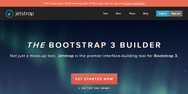
1. Jetstrap
There’s been a tremendous transformation around getting designs into the browser quite easily in the design process. Static wireframes and comps fail to display how a website design will look and perform in the myriad of web environments. To an addition, prototyping tools require some coding knowledge to get started.
Jetstrap is a fully web-based interface building tool for Twitter Bootstrap. It offers a way for web designers to collect rapid prototypes in the browser by dragging and dropping UI elements onto a canvas quickly. It doesn’t need any hardcore frontend development expertise to get started. In short, it is a powerful tool that can help you demonstrate how a design will work in its final environment.
2. Style Prototype
In the era of responsive web design, one of the biggest challenges that many web designers face is delivering a right balance between the efficient workflow and productive client deliverables. But to solve this problem, a powerful web responsive tool was developed, known as Style ProtoType. It was introduced to offer clients with a gist of colors, typography, and user-friendly environment.
Essentially, the Style Prototype allows you to display the true colors, animations, typography, button styles and other necessary elements in a site’s final environment.

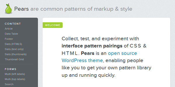
3. Pears
Pears is a great web responsive tool that allows people to collect, test, establish a better workflow with interface pattern pairings of HTML and CSS. It is an open source WP theme, which is developed by a designer Dan Cederholm for creating your own front-end style guide.
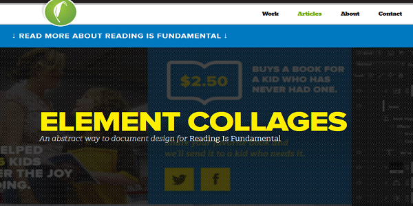
4. Element Collages
If your designer is creating full mockups in Photoshop and saying that “this is how your site will”, it makes no sense. Basically, web design is an art of merging all components, such as layout, text styles, colors, graphics, images and structure together to create a visually appealing website. In order to provide a better responsive web design, a famous designer Dan Mall created the Element Collages tool.
Element Collages are composed of visual explorations for interface components. These collages provide conversation across the visual direction without even creating entire comps.
5. Foresight.js
Bitmap images can look hazy on the high-resolution display screen, but loading high-resolution images can increase the weight of a web page. In such a situation, you can use Foresight.js tool that gives web pages the ability to tell if the web user’s device is capable of displaying high-resolution images or not.
6. Enquire.js
Media queries are great for CSS, and enquire.js is an ideal tool that allows you to utilize media queries in JavaScript, and giving you the tool to develop a classic responsive site.
The enquire.js is a script that uses matchMedia so that you can load scripts; perform functions and more when the right conditions are present.
7. Icomoon
Today, everyone is getting crazy over Retina screens. Retina and other higher resolution displays are quickly becoming the standard, and bitmap icons look fuzzy and confused on them. In order to solve this problem, it is important to create resolution-independent icons to develop a custom icon font and embedding them with CSS @ font-face. But with the use of Iconmoon, you can resolve this issue.
Icomoon is a great web tool that makes the procedure of crafting and extending icon fonts with ease. It allows you to choose from icons library and also enables you to upload by own. You can create your custom icon font and also download a package that contains the fonts and appropriate CSS.
8. Detector
Feature detection and device profiling can be a critical task. It is because the device libraries are tough to manage, but pure feature detection depends on client-side detection, and this can restrict the flexibility when you are delivering functionality to a wide range of user-agents.
In order to solve this problem, developer Dave Olsen built Detector, a PHP and JS-based browser and feature detection library. By utilizing the combination of Modernizr and user agent detection, you can determine device classes. Plus, it is compatible with new devices and browsers on its own.
9. MQTest.io
It becomes quite difficult to keep a track of what media queries a browser supports. But with the help of MQTest.io tool, you can detect which media queries your browser responds to.
10. BrowserStack
It can be challenging and costly to cross-check in a representative stack of devices and browsers. However, there is no substitute for testing on real devices, but BrowserStack offers remote access to a complete host of devices and environments enabling you to do some very serious QA.
Conclusion
In this blog, we have explained the 10 most powerful tools that can help you in creating a perfect responsive web design. You can use these tools to design a fully-responsive website that can access easily and seamlessly on different devices in order to give you a better user-experience.

 David Meyer
 Prince Kapoor
 Admin
Admin
 Sudeep Banerjee